Takeaways from Refactoring UI
I just read Refactoring UI, a book aimed at developers like me who know CSS and the basics of design, but whose designs always look a bit “off”. The book contains lots of specific tips and strategies for improving design and I really recommend it to anyone doing web development. Here’s the actionable principles I got from the book.
Have discrete levels
Use standard, pre-defined levels for properties like font-size, widths, spacing, and colours. A standardised system gives rhythm to a layout and means less decision making when designing.
Material design has nice discrete colour pallets
and bootstrap has discrete sizes for some typographical elements and buttons

but no framework I’ve used has consistent sizes and spacing across different elements and css properties. I ended up creating some SCSS variables of fixed sizes:
$spacing-8: 8px;
$spacing-16: 16px;
$spacing-32: 32px;
As for the scales, they should be evenly distributed perceptually rather than mathematically. For colours this means outsourcing: colour theory is easy to get wrong. For spacing this means small sizes should be closer together than large sizes: I know I’ve been guilty of violating this in the past by defining $spacing: 16px then using 0.5 * $spacing and 7 * $spacing everywhere.
Finally, the scales should use even pixel values to avoid sub-pixel rendering issues.
Style doesn’t always follow semantics
CSS frameworks and the default browser stylesheet both come with default styles based on the html element being used. These are often fine choices for document-style websites like blogs but it’s OK to override them.
For example, in an app-style website the top-level h1 heading is often obvious from the app context and page design, so it doesn’t need to be 72px tall.
h1 just takes up space.
Tailwind CSS (from the writers of Refactoring UI) has resets for things like headings and lists, so you can use the correct semantic element without the headache of overriding.
h1,
h2,
h3,
h4,
h5,
h6 {
  font-size: inherit;
  font-weight: inherit;
}

ol,
ul {
  list-style: none;
  margin: 0;
  padding: 0;
}
Sizes don’t scale together
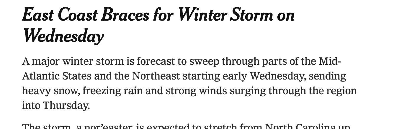
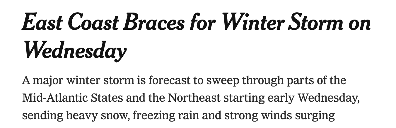
Resizing a UI isn’t as simple as rescaling everything: the relative difference between sizes needs to change too. On small screens, padding and spacing should be reduced to fit more in, and heading size can be decreased.
Here’s an example from a New York Times article. On desktop there’s a 2:1 ratio between heading and body, the ratio drops to 1.7:1 on mobile (on top of the body text getting 20% smaller):
I’ve been tossing up whether to use a CSS framework for my next project and many of the principles from Refactoring UI are at odds with the popular frameworks, meaning either lots of overrides or just compromise.
Tailwind CSS from the makers of Refactoring UI does uphold these principles and I’m excited to try it one day, but it relies heavily on PostCSS so it’s not something I can easily drop into my existing development workflows.
So I’ve been going by hand, taking classes from Tailwind CSS as needed and it’s working great. Flexblox and CSS grid solve most of the issues I used to need a framework for.