Semantic colours in data visualisation
Data visualisation software comes with a default colour palette for categorical data. These palettes are typically chosen for visual reasons: the colours must be distinct from each other yet have a cohesive theme.
But sometimes the data categories we are plotting have semantic associations with specific colours. Ignoring these semantic associations is at best a missed opportunity to improve comprehension, and at worst can lead to confusion or offence.
Default palettes
The categorical colour palette in plotting libraries often uses blue as the first colour then cycles through other colours with similar saturation:
Matplotlib
Google Sheets
ggplot2
d3 (category10)
Aside from the software you’re using, some publications specify colour pallets in a style guide:
stats.govt.nz
Quartz
Default pallets are a good thing: they look nice and are often designed to meet accessibility standards. But there are some situations where you might consider overriding the default colour scheme.
Logos and brands
Here’s a plot comparing the speeds of three different cloud providers.
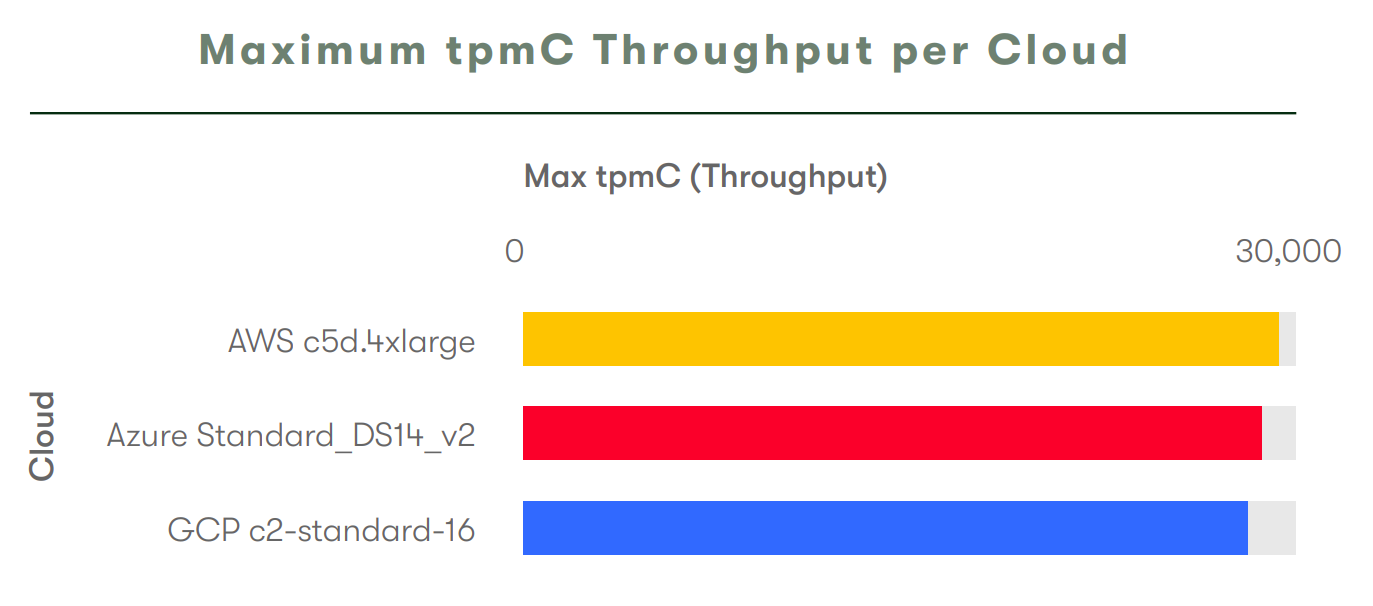
The same colour scheme was used for all the plots in the lengthy report, but for each one I had a double take at the colours and re-read the labels. Taking a look at the logos of the three cloud providers, maybe you can see why I struggle with this plot.

By swapping the colours for Azure and Google the visualisation would be made more interpretable for readers, who are likely familiar with the logos. This example still wouldn’t be perfect (Google doesn’t really have a strong single brand colour) but would still avoid confusion from users who associate blue with Azure.
Political parties are an example where visualisation colours are often chosen to correspond with logos:


Physical colour
Sometimes the categories we are plotting represent physical objects with actual colours, like fruit in this example.

While I’m not sure there’s a palette that would capture aesthetic, accessibility, and semantic concerns for this data (a lot of fruit has the same colour), swapping the colours for pomegranate and orange would be an improvement for starters.
Stereotypes
Stereotypes can create abstract associations between categories and colours. Take this example comparing graduation rates for women and men.
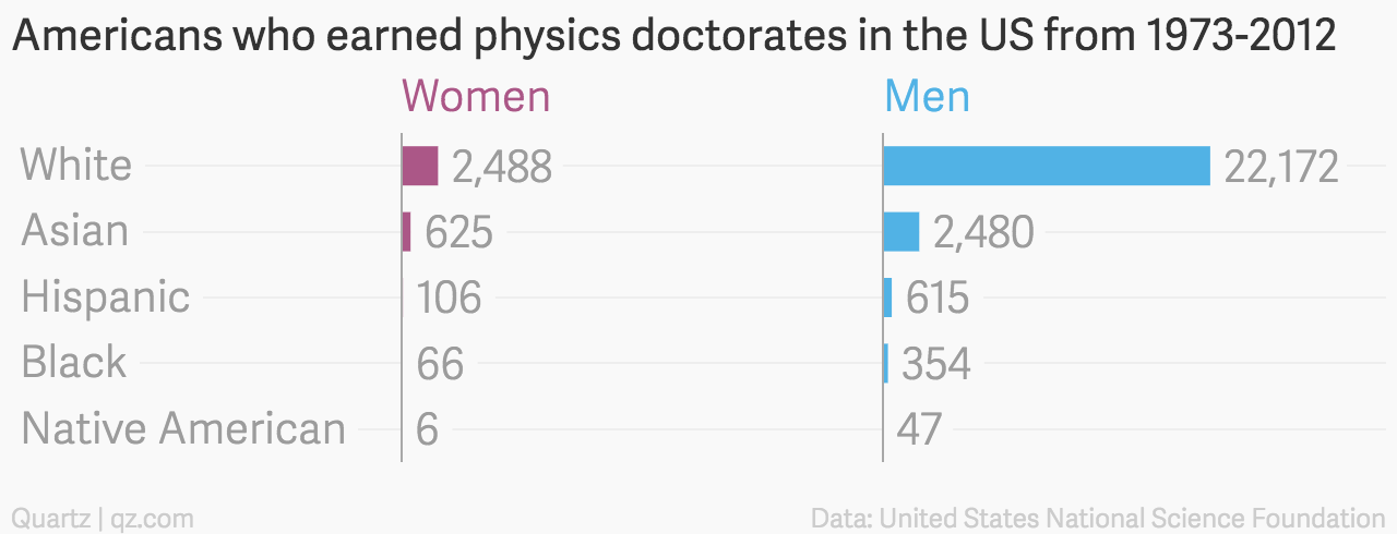
Readers familiar with the stereotype of blue for boys and pink for girls will find this plot easier interpret than if neutral colors were chosen.
Of course there are many stereotypes that we don’t want reinforce with our visualisations, whether or not those stereotypes are commonly represented by certain colours. Even the idea of having specific colours for genders may be problematic for some (Datawrapper has a nice discussion on their blog).
If you choose not to use semantic colours for this reason, still be aware of them to avoid confusion or offence. I frequently see confusing visualisations where women are coloured blue and men red or pink.
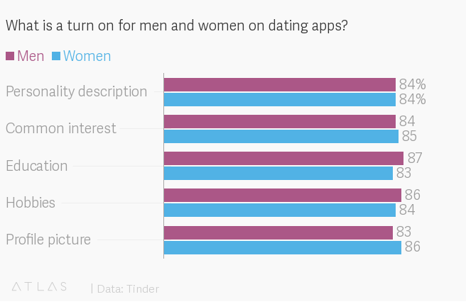
I imagine this comes from the default palette using blue then red and a dataset with women before men.
Avoiding bad colour choice
Working with colour palettes is a hassle in most plotting software. But there are some easy ways to avoid confusing colour choices without designing a new colour palette by hand:
- Choose a different colour palette. Many libraries have a couple of generic builtin palettes.
- Plot your data in the reverse order.
- Plot a series with no data (and exclude it from the legend) to skip an inappropriate colour.
Summary
- Semantic colours aid comprehension.
- Even if you don’t want to use semantic colours, be aware of them to avoid confusion.
- Consider stereotypes you may be reinforcing with your choice of colours.