Tufte in Matplotlib
This is a guide to making plots in the data-focused style of Edward Tufte, using Python and Matplotlib.
Rather than use libraries like etframes and tufte, I’ve given examples using stock Matplotlib, as I find the libraries too difficult to adapt to the peculiarities of individual datasets.
Tufte in R by Lukasz Piwek was the inspiration for this post.
Contents
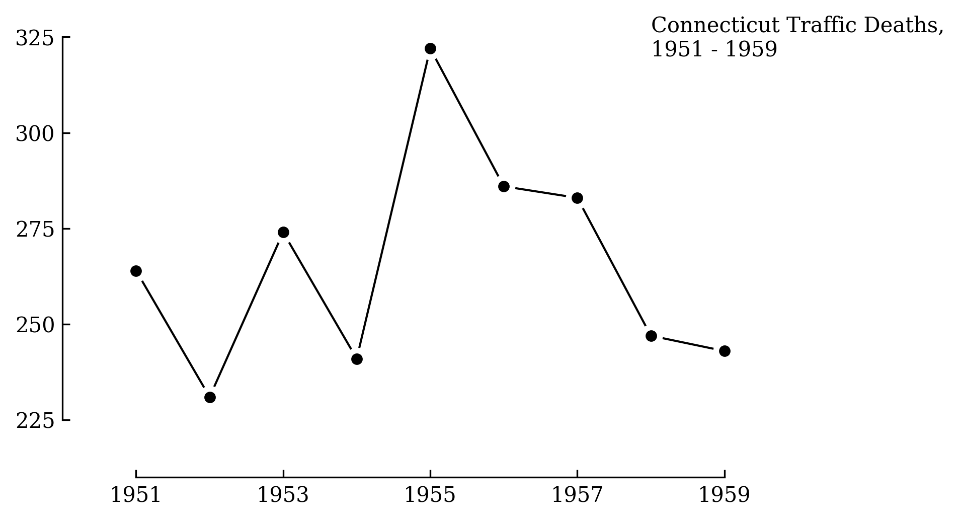
Line
First, the basic line graph from page 74 of The Visual Display of Quantitative Information.
The lines between points are shortened to give the actual data prominence. Information about the axes is included in the title instead of as labels directly on the axes. Some cruft is removed from the axes, leaving tick marks only for the range of the data.
import matplotlib.pyplot as plt
import matplotlib.ticker as ticker

# Global options.
plt.rcParams['font.family'] = 'serif'

# Data from p74 of Visual Display of Quantitative Information.
x = list(range(1951, 1960))
y = [264, 231, 274, 241, 322, 286, 283, 247, 243]

# Plot line, line masks, then dots.
fig, ax = plt.subplots()
ax.plot(x, y, linestyle='-', color='black', linewidth=1, zorder=1)
ax.scatter(x, y, color='white', s=100, zorder=2)
ax.scatter(x, y, color='black', s=20, zorder=3)

# Remove axis lines.
ax.spines['top'].set_visible(False)
ax.spines['right'].set_visible(False)

# Set spine extent.
ax.spines['bottom'].set_bounds(min(x), max(x))
ax.spines['left'].set_bounds(225, 325)

# Reduce tick spacing.
x_ticks = list(range(min(x), max(x)+1, 2))
ax.xaxis.set_ticks(x_ticks)
ax.yaxis.set_major_locator(ticker.MultipleLocator(base=25))
ax.tick_params(direction='in')

# Adjust lower limits to let data breathe.
ax.set_xlim([1950, ax.get_xlim()[1]])
ax.set_ylim([210, ax.get_ylim()[1]])

# Axis labels as a title annotation.
ax.text(1958, 320, 'Connecticut Traffic Deaths,\n1951 - 1959')
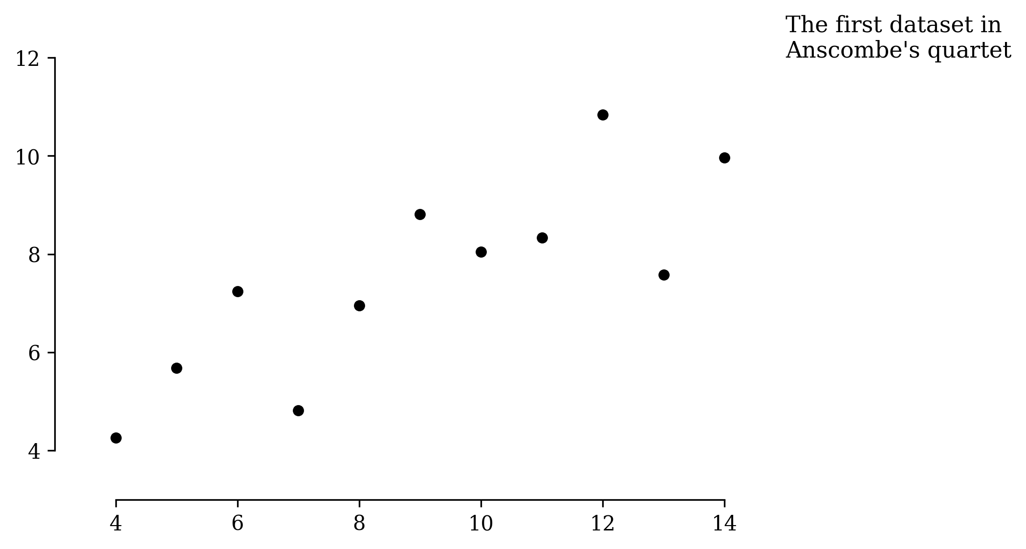
Scatter
Scatter plots are similar to line plots, just without the lines.
import matplotlib.pyplot as plt
import matplotlib.ticker as ticker

# Gobal options.
plt.rcParams['font.family'] = 'serif'

# Anscombe's quartet #1.
x = [10, 8, 13, 9, 11, 14, 6, 4, 12, 7, 5]
y = [8.04, 6.95, 7.58, 8.81, 8.33, 9.96, 7.24, 4.26, 10.84, 4.82, 5.68]

# Plot the dots.
fig, ax = plt.subplots()
ax.scatter(x, y, color='black', s=20)

# Remove axis lines.
ax.spines['top'].set_visible(False)
ax.spines['right'].set_visible(False)

# Increase y tick spacing.
ax.yaxis.set_major_locator(ticker.MultipleLocator(base=2))

# Set spine extent.
ax.spines['bottom'].set_bounds(min(x), max(x))
ax.spines['left'].set_bounds(4, 12)

# More room for data.
ax.set_xlim([3, 14.2])
ax.set_ylim([3, 12])

# Title.
ax.text(15, 12, "The first dataset in\nAnscombe's quartet", size=11)
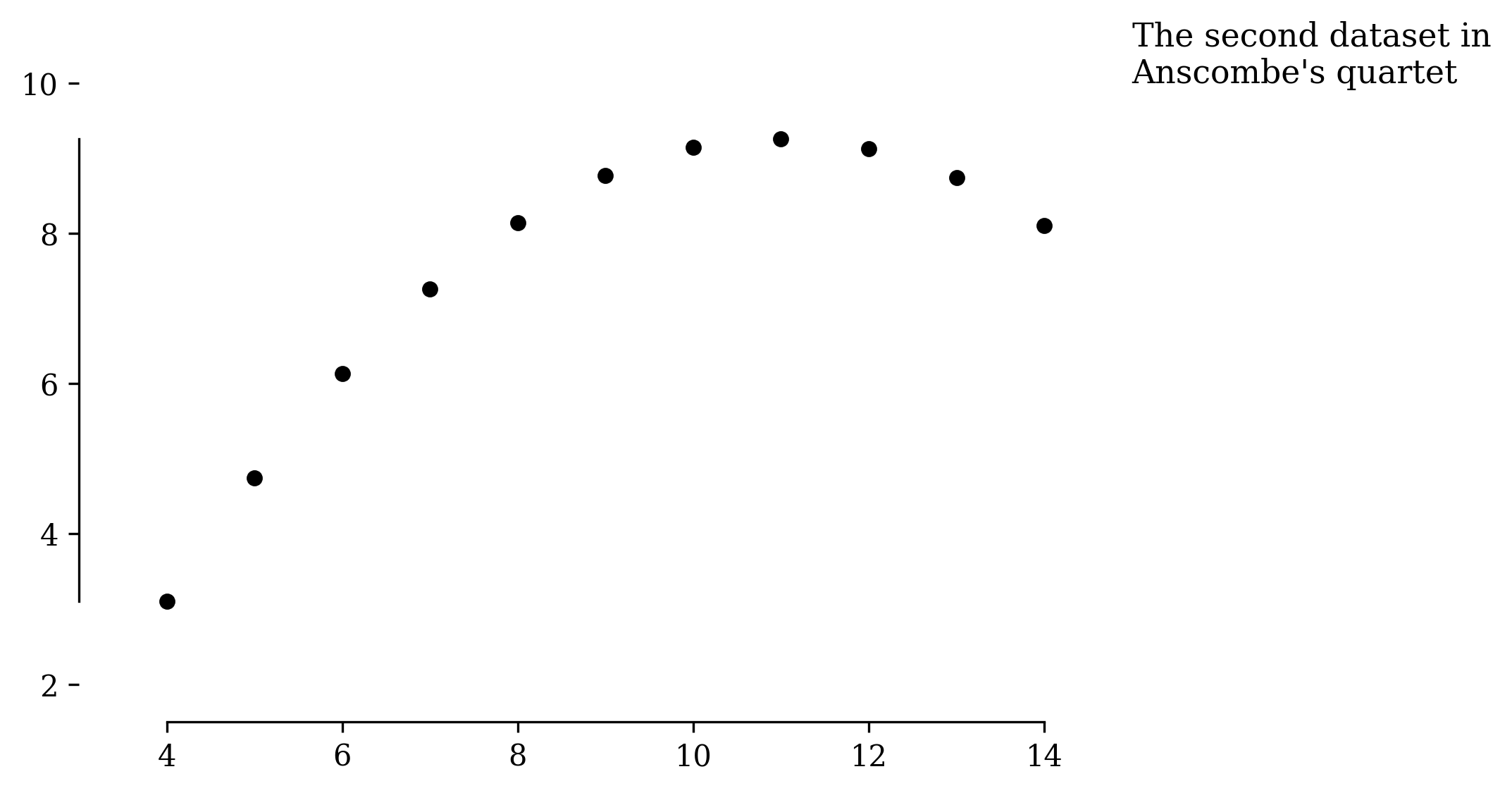
Range frames
Tufte proposed the concept of range frames: axes that only cover the extent of the data, giving the reader a sense of range at a glance. I don’t use range frames for published plots as most readers are unaware of the convention. But I do use them in my own work.
Here you can clearly see the data spans from exactly 4 to 14 on the x-axis, and roughly 3 to 9 on the y-axis.
import matplotlib.pyplot as plt
import matplotlib.ticker as ticker

# Gobal options.
plt.rcParams['font.family'] = 'serif'

# Anscombe's quartet #2.
x = [10, 8, 13, 9, 11, 14, 6, 4, 12, 7, 5]
y = [9.14, 8.14, 8.74, 8.77, 9.26, 8.1, 6.13, 3.1, 9.13, 7.26, 4.74]

# Plot the dots.
fig, ax = plt.subplots()
ax.scatter(x, y, color='black', s=20)

# Remove axis lines.
ax.spines['top'].set_visible(False)
ax.spines['right'].set_visible(False)

# Increase y tick spacing.
ax.yaxis.set_major_locator(ticker.MultipleLocator(base=2))

# Range frames..
ax.spines['bottom'].set_bounds(min(x), max(x))
ax.spines['left'].set_bounds(min(y), max(y))

# Range frame alternative

ax.set_xlim([3, 14.2])
ax.set_ylim([1.5, 10])

# Title.
ax.text(15, 10, "The second dataset in\nAnscombe's quartet", size=11)
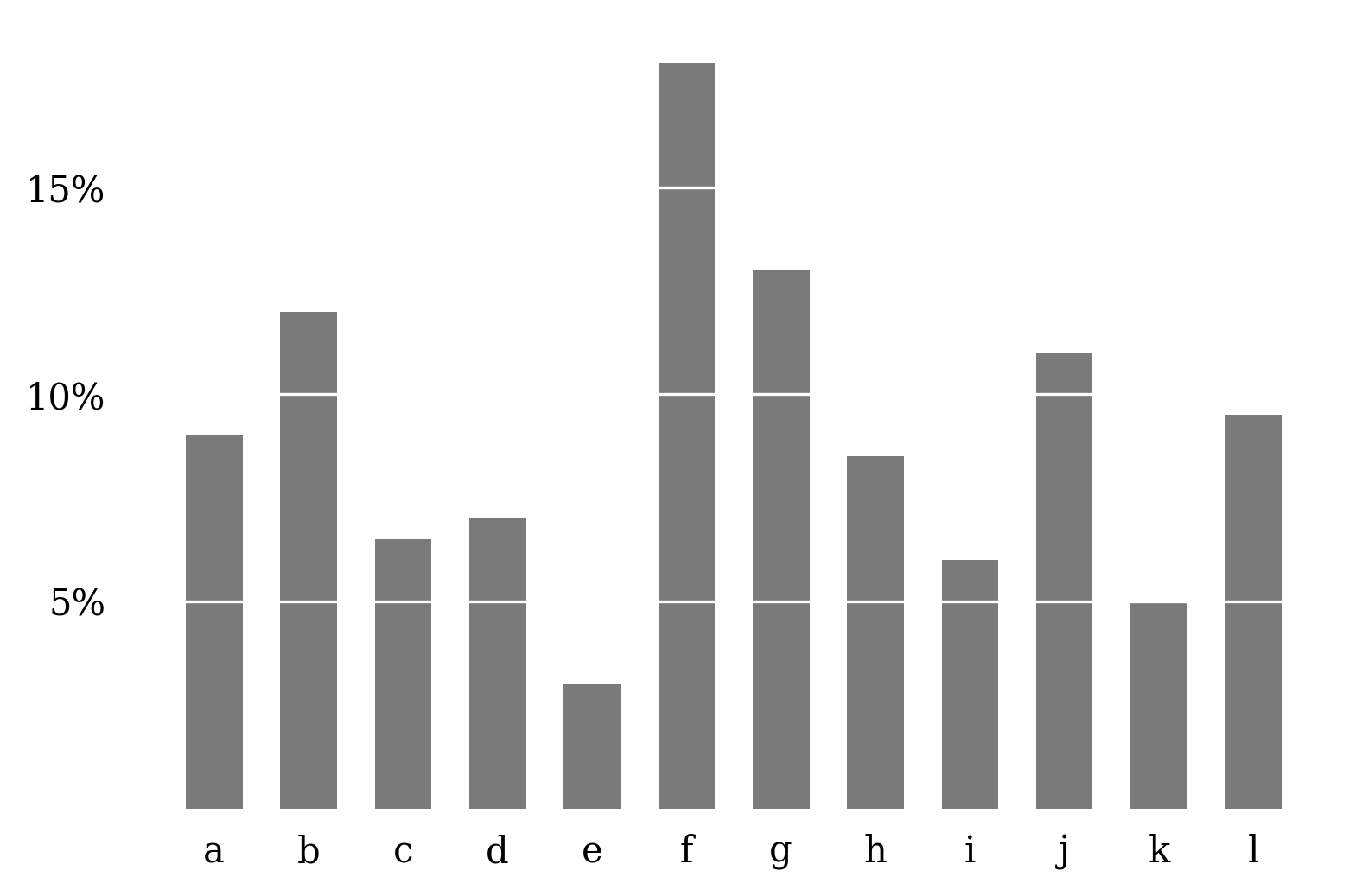
Bar
Tufte’s take on the bar plot removes most of the axes ink in favour of lines on the bars themselves.
import matplotlib.pyplot as plt
import matplotlib.ticker as ticker

# Gobal options.
plt.rcParams['font.family'] = 'serif'

# Data from p128 of Visual Display of Quantitative Information.
y = [9, 12, 6.5, 7, 3, 18, 13, 8.5, 6, 11, 5, 9.5]
labels = ['a', 'b', 'c', 'd', 'e', 'f', 'g', 'h', 'i', 'j', 'k', 'l']

# Plot the bars.
fig, ax = plt.subplots()
x = list(range(len(y)))
ax.bar(x, y, color='#7a7a7a', width=0.6)

# Remove axis lines.
ax.spines['top'].set_visible(False)
ax.spines['right'].set_visible(False)
ax.spines['bottom'].set_visible(False)
ax.spines['left'].set_visible(False)

# Add labels to x axis.
ax.set_xticks(x)
ax.set_xticklabels(labels)

# Add labels to y axis.
y_ticks = [5, 10, 15]
ax.set_yticks(y_ticks)
ax.set_yticklabels(y_ticks)
ax.yaxis.set_major_formatter(ticker.PercentFormatter(decimals=0))

# Remove tick marks.
ax.tick_params(
    bottom=False,
    left=False,
)

# Add bar lines as a horizontal grid.
ax.yaxis.grid(color='white')
Slope lines
Tufte’s slope line plot shows the change in some measurement for different groups. The raw values are presented as in a table, while the sloping lines give a sense of the direction and magnitude of the change for each group.
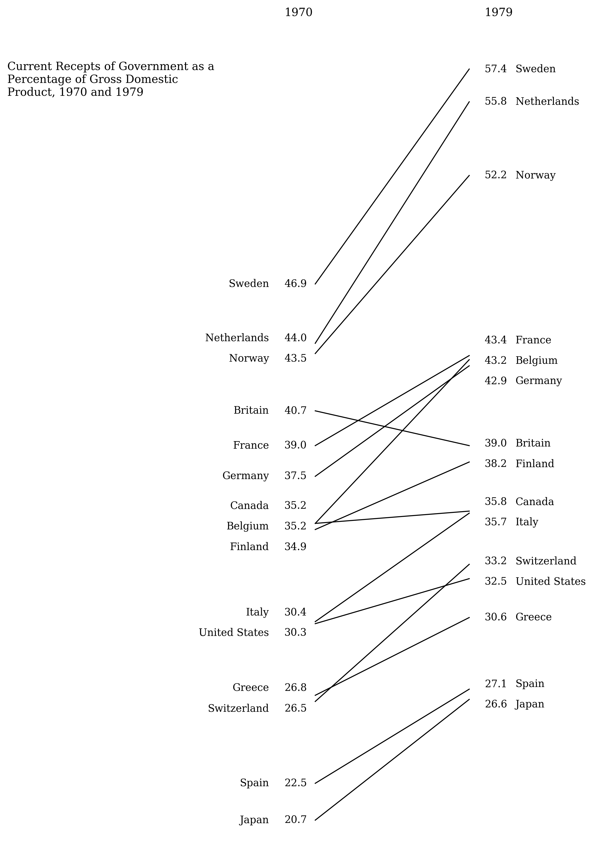
The code here includes a lot of complexity to resolve overlapping data labels. It might be easier to set the label positions by hand.
import numpy as np
import matplotlib.pyplot as plt

# Gobal options.
plt.rcParams['font.family'] = 'serif'

# Data from p158 of Visual Display of Quantitative Information.
labels = [
    'Sweden', 'Netherlands', 'Norway', 'Britain', 'France', 'Germany',
    'Belgium', 'Canada', 'Finland', 'Italy', 'United States', 'Greece',
    'Switzerland', 'Spain', 'Japan'
]
y_left = [46.9, 44, 43.5, 40.7, 39, 37.5, 35.2, 35.2, 34.9, 30.4,
    30.3, 26.8, 26.5, 22.5, 20.7]
y_right = [57.4, 55.8, 52.2, 39, 43.4, 42.9, 43.2, 35.8, 38.2, 35.7,
    32.5, 30.6, 33.2, 27.1, 26.6]

# Plot the lines..
fig, ax = plt.subplots(figsize=(3, 15))
for left, right in zip(y_left, y_right):
    ax.plot([0, 1], [left, right], color='black', linewidth=1)


def resolve_overlaps(y, lh):
    '''
    Given a sorted list of y values, adjust them so all adjacent values are
    more than lh distance apart.
    '''
    y = np.asarray(y)
    y_new = y.copy()

    diff = np.abs(y - np.roll(y, -1))
    overlaps_with_next = diff < lh
    if not(any(overlaps_with_next)):
        return y

    id_ = 0
    bunch_ids = np.nan * y
    for i in range(1, len(y)):
        if overlaps_with_next[i]:
            bunch_ids[i] = id_
        elif overlaps_with_next[i-1] and not overlaps_with_next[i]:
            bunch_ids[i] = id_
            id_ += 1
    if overlaps_with_next[0]:
        bunch_ids[0] = bunch_ids[1]

    for id_ in np.unique(bunch_ids[np.isfinite(bunch_ids)]):
        bunch = y[bunch_ids == id_]
        bunch_new = bunch.copy()
        n = len(bunch)
        centre = bunch.min() + (bunch.max() - bunch.min()) / 2
        bunch_new = np.linspace(centre - (lh * (n-1)/2), centre + (lh * (n-1)/2), n)
        y_new[bunch_ids == id_] = bunch_new

    return y_new


# Draw left label and value. Need to sort labels first, then adjust for overlaps.
line_height = 1
y_left_sorted, labels_sorted = zip(*sorted(zip(y_left, labels)))
y_left_plot = resolve_overlaps(y_left_sorted, line_height)
for y, y_text, label in zip(y_left_sorted, y_left_plot, labels_sorted):
    ax.text(-0.2, y_text, '{:.1f}'.format(y), va='center')
    ax.text(-0.3, y_text, label, ha='right', va='center')

# Same for the right labels.
y_right_sorted, labels_sorted = zip(*sorted(zip(y_right, labels)))
y_right_plot = resolve_overlaps(y_right_sorted, line_height)
for y, y_text, label in zip(y_right_sorted, y_right_plot, labels_sorted):
    ax.text(1.1, y_text, '{:.1f}'.format(y), va='center')
    ax.text(1.3, y_text, label, va='center')

# Remove axis lines.
ax.axis('off')

# Annotations.
title = 'Current Receipts of Government as a'
title += '\nPercentage of Gross Domestic'
title += '\nProduct, 1970 and 1979'
ax.text(-2, 56.1, title, size=11)
ax.text(-0.2, 60, '1970', size=11)
ax.text(1.1, 60, '1979', size=11)
General principles
- Matplotlib has dense tick spacing. For some scientific plots this can be important, but plots are often easier to interpret with looser spacing.
- The top and right axes can be removed from most plots.
- For one-off publication-ready plots, roll up your sleeves and hardcode axis limits, ticks, and text positions. Matplotlib's defaults aren't generic enough for all usecases.